PEACHTREE CITY, USA – Aventure has updated its company logo, debuting a refreshed and modern approach reflecting the company’s continued growth, innovation, and commitment to excellence in the aviation industry.
The streamlined design keeps key portions of the previous logo, but introduces a new color palette that will also be used in Aventure’s overall brand. The previous blue, red, and gray have been replaced with a more refined deep blue and vibrant orange.
“Orange is know to convey confidence, and conjure feelings of optimism, enthusiasm, and warmth,” said Aventure marketing associate Michael Griffiths Jr. “It also pays homage to Aventure’s roots in Georgia, which is also known as the ‘Peach State’.”
Perhaps the most significant change to the logo is the removal of the world “aviation.”
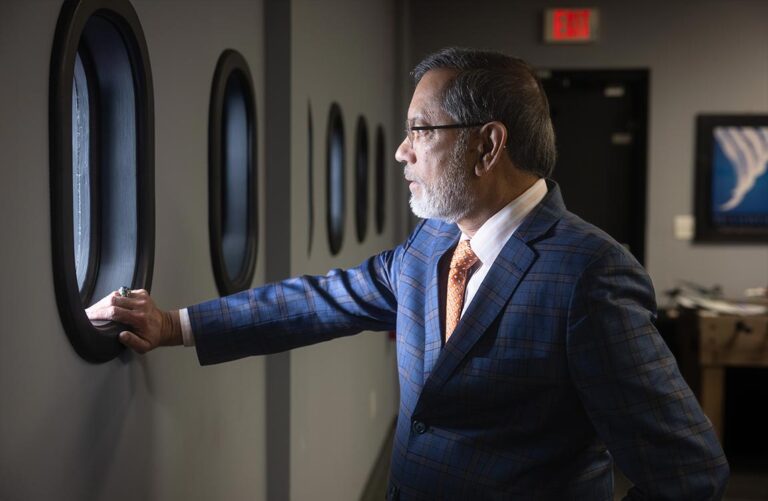
“This reflects Aventure’s evolution into a well-established brand in our industry,” said CEO Zaheer Faruqi. “Since our founding over two decades ago, the name Aventure has become synonymous with quality and reliability in aviation, making it no longer necessary for the logo to explicitly convey the name of the industry we serve.”
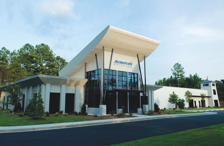
Aventure’s original 2002 logo was updated significantly in 2007. This was during a significant period of growth that would see the company move to its current headquarters in Peachtree City, Georgia in 2008, and be declared an “Exporter of the Year” by the U.S. Small Business Administration (SBA) in 2009.
The logo was refined slightly in 2012, with the removal of file lines for better visibility in the digital age.
The latest logo evolution comes as Aventure, again named an “Exporter of the Year” by the SBA, reaches a new level of expansion with a state-of-the-art 70,000 square-foot warehouse set for completion this summer, to be followed by an additional 90,000 square feet of office and warehouse space.